Become Inspired
by a few of our favourite projects
Find out what our clients have to say about us.
Branding
Website Design
We created a sleek, professional website for VistaOne Inc. that showcases their engineering and construction expertise. With strong visuals and easy navigation, the site highlights their work clearly and confidently—helping them connect and build lasting partnerships.
VISIT SITEWe designed a clean, professional website for GFW Law that reflects their commitment to excellent legal service. With easy navigation and a modern look, the site helps them stand out and connect confidently with clients.
VISIT SITEWe created a sleek, user-friendly website for VanKuik Construction that highlights their expertise and quality work. The design showcases their projects with professionalism, strengthening their online presence to connect with clients and grow their business.
VISIT SITEWe boosted Torque Diesel’s online presence with a sleek, powerful site that highlights their expertise. The bold, easy-to-navigate design showcases their services, skilled team, and equipment—driving their brand forward with confidence and horsepower.
VISIT SITEWe designed a stunning website for Victoria May Photography that reflects her creative style. The site showcases her vibrant portfolio and offers an easy booking experience, making her online presence as bright and elegant as her work.
VISIT SITEWe gave FayTrim a sleek, modern website that highlights their expert trimming and landscaping services. With a clean design and easy navigation, the site makes it simple for clients to connect—professional, approachable, and built to help outdoor spaces shine.
VISIT SITEWe partnered with SNC Family Law to build an approachable, professional website that’s easy to navigate. The clean design highlights their family-focused services and offers a warm, welcoming space, reflecting their commitment to support and compassion throughout every step.
VISIT SITEWe created a clean, modern website for Wilco Built that highlights their craftsmanship and quality. The sleek design and easy navigation help visitors explore their projects and services, strengthening their online presence and client connections.
VISIT SITEWe gave XOH Powerline a dynamic, confident website that highlights their powerline expertise. The clean design and bold visuals showcase their commitment to safety and quality, powering up their online presence to connect with clients and grow their business.
VISIT SITEWe redesigned Brain Injury Services’ website with accessibility as a priority. The clean, user-friendly site features thoughtful layouts and calming colors, making it easy for everyone—including those with brain injuries—to find support and resources. It’s a compassionate, professional online space serving their community well.
VISIT SITEWe redesigned Sequoia Counselling’s website with a fresh, calming look that reflects their compassionate approach. The easy-to-navigate site offers helpful resources and feels like a safe, inviting space—helping them connect with and support their community with care.
VISIT SITEWe designed a fresh, user-friendly site for Total Plumbing Services that matches their expert work. The clean, easy-to-navigate site helps customers explore services and get in touch, reflecting their reliable, no-fuss approach perfectly.
VISIT SITEWe loved creating a fresh, professional site for AEGIS Healthcare Solutions, showcasing their vital healthcare services. Owned by paramedics, the site highlights their team’s dedication and connects AEGIS clearly and easily with the community they serve.
VISIT SITEWe gave Georgian Protection a sleek website that reflects their commitment to safety. With a polished look and easy navigation, the site helps visitors explore services and connect quickly. It’s security you can see and trust.
VISIT SITEWe redesigned J&C Tree Services’ website to showcase their expertise and dedication. The clean, modern site highlights their services and skilled team, making it easy for customers to connect and helping their business grow—one tree at a time.
VISIT SITEApti Physiotherapy & Beyond got a fresh new look! We redesigned their site with an athlete-focused feel that’s sleek, easy to navigate, and highlights their expert care. It’s a bold upgrade that brings their brand to life—modern, polished, and built to perform.
VISIT SITEWe gave Alpro Metal Roofing a sleek, modern site that reflects their quality craftsmanship. The new design makes it easy for visitors to explore options, learn benefits, and connect—helping Alpro stand out with a user-friendly, polished online presence.
VISIT SITEWe teamed up with Beach Marine Canoes for a fresh, vibrant site that captures their adventurous spirit. Easy to navigate and stylish, it showcases their canoes and gear, making browsing and booking a breeze for paddlers of all levels.
VISIT SITEMauro at Royal York Landscape Lighting has been lighting up the GTA since 2003. With plans to expand into Muskoka, we built a polished website that showcases his expert work, quality products, and educates clients—built to grow with his business.
VISIT SITEFor Marcelville, a custom cabinetry and furniture studio, we built a sleek website that highlights their expert craftsmanship. The curated gallery showcases everything from custom kitchens to restored pieces—putting their artistry front and centre.
VISIT SITEDannik Plumbing got a fresh new look with a clean, professional website that highlights their services and boosts SEO. It’s easy to use, with quick contact options and a design that’s polished, practical, and built to perform—just like them.
VISIT SITEDouble Down Divers needed a site that brought their scuba courses and group trips together. We built a fun, modern site that’s easy to explore and book, showcasing their underwater expertise with a splashy, streamlined design.
VISIT SITEAmy Pritzker, a Registered Social Worker, needed a website that reflected her compassionate approach. We created a calming, inclusive design that speaks to her values and clients’ experiences—a warm, welcoming space she’s proud to share.
VISIT SITEVibrant Healing wanted a smoother, more relaxing site experience with CRM integration. We delivered a calm, wellness-focused design that also streamlines operations—saving the team time daily and leaving them thrilled with the results.
VISIT SITESafeK9 Education & Dog Care Centre isn’t your average dog facility; they specialize in enrichment programs designed to keep pups happy, healthy, and thriving. They needed a website that was both informative and strategic: one that attracts the right clients, gently filters out those who aren’t the best fit, and makes it easy to book first aid courses and off-leash trail adventures online. The final result? A fun, professional site that speaks to their unique vibe and makes life easier for both the SafeK9 team and their two and four-legged clients.
Angela (Bloom & Thrive Therapy Services), a Registered Social Worker and Psychotherapist, needed a site that reflected her approach and connected with clients. We built a warm, professional site with online booking, system integration, and space for resources—and she’s thrilled with the result.
VISIT SITEB.C. Roofing & Sheet Metal needed a website and workflow upgrade. We delivered a clean, modern site with CRM integration, improved mobile use, and easy quote requests—a major upgrade that works as hard as they do.
VISIT SITETereena (Clear View Therapy), a registered social worker, wanted a site that connects personally and offers easy online booking. We created a warm, welcoming space that’s approachable, compassionate, and ready to help.
VISIT SITEMcFarlane Appraisals needed a smarter website, and we delivered. With CRM integration, they capture leads easily, track conversions, and grow their business—making them as agile online as in the field.
VISIT SITERoyal LePage Terrequity SW Realty needed a polished site to attract top investors and clients. We delivered a sophisticated, lead-tracking platform that matches their upscale brand and supports confident growth.
VISIT SITETom and Lucie (Lac McGillivray) took the reins of the family business and knew it was time for a website refresh. They wanted a one-stop online hub where customers could easily book cabins, explore the camp, and handle payments, all without the hassle. We delivered a sleek, user-friendly site that checks all those boxes and then some. Now, booking a stay is a breeze, and managing payments is simpler than ever. This website truly brings their family camp into the digital age with style and ease!
We transformed Kit & Kaboodles’ dated site into a fresh, modern e-commerce platform. Plus, we taught them to easily update content, creating a vibrant, user-friendly online presence ready to grow.
VISIT SITEMiller Pickard – Criminal Law & Young Offenders, needed a modern site to showcase their services and expertise. We created a sleek, user-friendly site they can easily update—giving them a sharp, professional online presence.
VISIT SITEIndependent Building Group (IMP North) wanted a site to showcase their expertise and stand out. We delivered a polished, professional site that gave them a fresh edge and confidence to shine.
VISIT SITEBaskets & Blooms For You Inc. wanted a fresh, modern Shopify store. We improved browsing, added smart upsell tools, custom delivery options, and a feature to block full delivery dates—creating a polished, user-friendly shop ready to bloom.
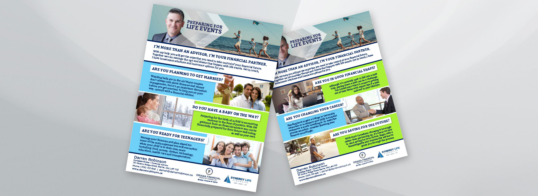
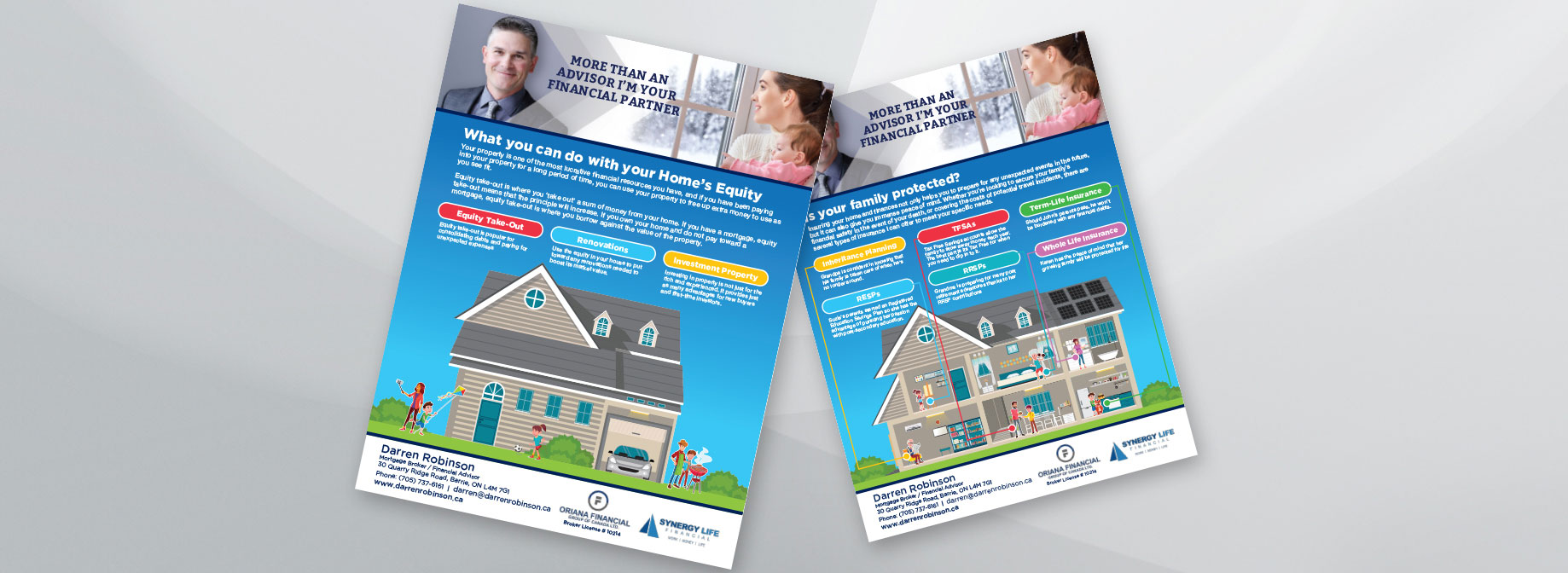
VISIT SITESynergy Life Financial wanted a website that’s both informative and appealing to a wide range of clients, all in one place. Their goal? To create a platform that grows alongside their diverse client base, welcoming everyone with clear, helpful info tailored to different needs. We delivered a smart, versatile site that’s ready to support their mission and help their business and clients thrive together.


