You’re reviewing a design you asked for from your marketing agency and the graphic designer mentions an acronym like you should know what they are talking about but you have no idea? Some terms they use are easy enough to figure out, while others seem to be glyphs written in Latin… We get it, that’s why we have put together this handy guide covering the most common words you will hear in your designer’s vocabulary, and we explain what they mean in plain English.
Basic Graphic Design Terms That You’ll Hear & What They Mean
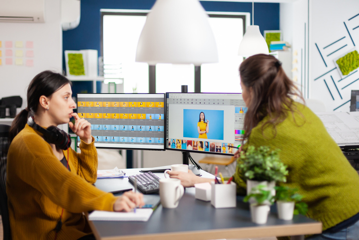
Whether you’re talking to a graphic designer, creative director, or advertising account rep when developing creative for a flyer, your website, or a digital advertising campaign you’re probably family with a few of these and others you might be reading for the first time:
Body copy / copy / text / content: Basically the words that tell your story, whether it’s in print, on a website, or a newsletter.
Comp / concept: A rough first draft of a design which could be a pencil sketch or basic digital design. In English: the blueprint on which a graphic design project is built. The starting point if you will for the main idea for whatever you are creating.
Mock-up: A step-up from the comp, this is a more realistic idea of how the design will look, usually with “Greek” type also known as “Lorem Ipsum” and “for position only” photos (in other words, not final). Generally, this is the point from which a client will decide to move forward with the design or will request changes if it’s not quite right yet.
Mood board / Vision board: A collection of images and text that represent your target audience, your colour palette, related images, headlines, and copy statements. The idea is to give a feel for the design and a guideline as to how it will eventually pan out. And, sometimes it’s just a bunch of scraps stapled or glued to a bristol board but, it includes little bits of inspiration for your project.
Typography / Type: Believe it or not, the fonts, weight, and colour of type are a big part of any design. Many designers are really passionate about it while others keep it basic. Generally, a brand will have a signature style and font that they stick to which is outlined later on in your branding guidelines.
Images and Graphic Design Formats To Know About
When it comes to design, there are many elements involved but probably the most important are the images that will represent your brand and be included in your design. When talking about them your designer may throw out a few of these terms especially if they are requesting print-ready artwork or a copy of your logo.
Image Files – AI, EPS, GIF, JPEG, Photoshop, PSD, TIFF, PNG, Vector. These are all types of image files that designers use. They each have their own purpose, some are for the web while others are for print, and some of them are interchangeable (EPS and vector). If a designer asks you for a file, they will usually be very specific about the type they want and the acronym is really the file extension at the end of the file name like: myimage.jpg.
AI files are illustrations, EPS files are usually illustrations as well. These scale up and down without becoming pixelated so if you are creating a billboard for example everything stays crisp even at 10 feet tall. A GIF, if you have ever seen a meme that moves or has text appear like a speech bubble that repeats over and over again, it’s likely a GIF. A JPEG also written as a JPG is for a photograph. And, a TIFF is as well but, TIFF files tend to be really big copies of images whereas a JPG has a smaller file size typically. A Photoshop or PSD file is a specific file that can only be opened in software that is called “Photoshop” which is used for image editing. A PNG file is a small version of an illustration without any background which is very commonly used for the logo on your website, for example. And, any time they request a vector file they are referring to the AI or EPS files. In plain language, they want a copy of whatever it is, in a file format that they can make larger or smaller without losing any clarity.
Resolution – Pixel / DPI / PPI : These are all measures of image quality based on DPI (which stands for dots per inch) for printed works and PPI (which stands for pixels per inch) for digital work. The higher the resolution, the sharper the image because the more dots or pixels per inch there are. A pixel is the smallest unit of a digital image that can be displayed.
Rasterized / bitmaps : Generally these are low resolution images or graphics used for placeholders or proofing.
RAW: A RAW image is the original unprocessed image data from a digital camera. It’s the original snapped digital file of that image if you will.
PDF: A PDF is a (portable document format) that can be used for printing at a high resolution or proofing at a low resolution. This is the type of file you save that finalizes the design so that it can’t be modified but, can be easily shared or printed.
Layout Terms For Graphic Design
A lot of these terms are basic rules of design – whether it’s graphic design, photography, or fine art. You may hear your designer use these words but they are more often used in conversation with other creative people.
Layout Style – Alignment / Balanced / Unbalanced: Alignment can refer to text but also to how the text and photos or graphics line up with each other. Balance/unbalanced is how design elements are distributed to guide the reader’s eye through a page.
Design Styles – Radial / Golden Ratio: Radial design has a central focal point, with elements spreading outward. Whereas the golden ratio is a mathematical ratio found in nature which influences graphic design. The most common of these is the rule of thirds.
Spacing and Frameworks – Grid / Margins / Negative Space / White Space: Designers use a framework, or grid, to design accurately. Margins are the spaces around the edge of a “page”. The space surrounding the words and shapes in your design is called negative space. White space includes any part of a design without graphics or text.
Photography Terms – Rule of thirds / Knolling / Scale: The rule of thirds divides an image with 2 vertical and 2 horizontal lines to determine an appealing focal point where two of those lines cross. Knolling is a photo technique where items are placed at 90-degree angles and shot from above. And, scale is often used in photography in reference to the size of an item in relation to another item (ie. an elephant next to a cat).
Printing Terms – Bleed / Creep / Crops or Crop Marks: Printed graphics have “trim lines” for where the paper is cut, the bleed is the area outside of this that gets trimmed off. It is added to images so a white line does not appear. Creep refers to the moving or shifting of margins when pages are folded or cut during the finishing process of a book or magazine. And, crops or crop marks are the markings that tell the printer where to cut to create the final shape of the printed product.
Graphic Design In Terms Of Colour
You may hear these descriptions when you’re working in any kind of design – whether it’s graphic design, photography, or fine art. A colour wheel is one of the building blocks your designer will work with which is shown below.
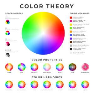
Combinations on the Colour Wheel: Analogous colours are shades close to each other, ie. red/orange, whereas complementary colours are opposite each other on the colour wheel and have higher contrast. Cool colours are colours that have a calming effect while warm colours cause excitement. And, Triadic themes are made up of three colours equally dispersed around the colour wheel.
Colour Palette: A designer will choose a palette for their layout, similar to an artist, with added variations. A Hue is the purest form of the original colours—red, orange, yellow, green, blue, and violet. And a Shade is black added to a hue. A Tint is white added to a hue. And, Tone is the lightness or darkness of a hue that can be changed by increasing the neutral gray. Then you have Monochrome which is a palette built out of various shades and tints of one colour while grayscale only uses black, white and shades of gray.
Colour Composition: Each colour is made up of other colours in these formats. CMYK (Cyan, Magenta, Yellow and Key more commonly known as black)) is used for print. And, RGB (Red, Green and Blue) is the colour mode for digital images. Hex codes are a six-digit code used in computer design programs AKA the colour code of a specific colour you use in your website. Lastly, Pantone® colours are specific colours that are identified by a code for printing or design by a company called “Pantone®. Think of a Pantone® as a whole can of paint, in a specific colour.
Colour Effects – Gradient /Opacity / Saturation: These are ways a designer can manipulate the colours in their design. A Gradient is a gradual shift from one colour to the next. The Opacity is a measurement of a colour’s transparency. And Saturation is the intensity of a colour.
Understanding A Graphic Designer’s Lingo When It Comes To Type
Although many people don’t think about it this way, typography is an important part of design, whether for websites, a newsletter, or print projects. The type can give your project a feel that works with the graphics. Your designer will generally use a font that is already associated with your brand and they will use it over and over to create consistency throughout all your marketing materials.
Types of Fonts: Serif fonts have edges or tails that stick out from letters that look more traditional. Sans serif has no small lines at the end of each character for a more modern looking type many might refer to as block lettering. Script fonts look like cursive handwriting and are often used for invitations whereas slab serif is composed of thick, sturdy lines, often used for headlines.
Fonts – Weight And Spacing: Font weight can be bold, light, thin, or medium but, not all fonts have a variety of weights. Kerning is the space between the letters. Leading is the space between the lines of text. And, tracking is similar to kerning but is the space between the letters of a word. All of which can be increased or decreased to achieve a desired look. An orphan is a word that is the only one on the line of text in a paragraph. And, a widow is seen in justified text when the words get spaced out too far to even up the alignment.
Type Design – Display / Hierarchy / Pull Quote: Large, prominent type, like headlines, designed to catch the viewer’s eye is called display type. Hierarchy describes the way text is grouped to lead a reader through the content. And, a pull quote is an excerpt from the main text that is highlighted in a graphic style. Magazines quite often will use a pull quote in the middle of an article to call attention to a statement someone made in an interview, for example.
Other Designer Jargon – Greek Type / Lorem ipsum / Mouse Type: Greek type, or Lorem ipsum, is used as a “filler” for text in a mock-up or design when content is not yet available. It’s basically fake text designed to look like actual wording and is used as placeholder text. Mouse Type is legal type or disclaimers that are in a small font at the bottom of ads or articles because, you guessed it, it’s little, like a mouse.
Words That Designers Use For Printing
Although print advertising is not as popular as it once was, there are many terms that describe the finishing of a project that contribute to the overall feel of the design which are good to know about like:
Printing Finishes – Die cut / Foil Stamp / Emboss / Deboss: Die cuts are used to create unique shapes for printed pieces, in other words, not straight, like when you print a door knocker that has a hole cut out of the center to slip over the door knob. Foil stamping is pretty much what it sounds like, adding a foil as an overlay with a stamped graphic. You often see this in wedding invitations or as an embellishment on a business card to make it feel richer. Embossing raises a specific area while debossing lowers a selected area which is done by pressing the paper with a specific shape.
Feeling Better About All That Graphic Design Talk? Good! Let’s Talk About Your Next Design Project.
Now that you have a basic guide to designer jargon, are you ready to tackle that next creative project or review? If you’re still feeling a bit lost, it’s best to give the experts a call. We’ll be happy to walk you through our design process, and answer any questions you have, and as education is a big part of what we do we always explain things in “English” as we go so you know exactly what we are talking about and why it’s important. If you have an idea you’d like designed, give 3SIXTY a call at 647-250-1494, or book a free consultation with us today to get started. Making you look good is what we do.


